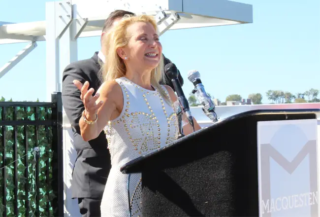
Like it or not, “I own it,” Rella Fogliano said on Thursday at the grand opening of The Modern apartment building in Mount Vernon.
Not only did she build the $31.5 million, 11-story residential structure, she “owns” the design.

The Modern, at 130 Mount Vernon Ave., a block away from the Mount Vernon West train station, has introduced a splash of color in an otherwise drab industrial neighborhood.
Actually, there are many splashes. The façade is a quilt of yellow, orange, red, pink, violet and blue concrete panels.
Fogliano, president of MacQuesten Development in Pelham, did not want to work in beige or red brick.
“I”™m having a Kermit the Frog moment,” she told about 50 people assembled on the roof deck, referring to the Sesame Street song, “It”™s not easy being green.”
The difficulties of being green can refer to the challenges of certifying a building as green or environmentally friendly. But to Fogliano the song is about being different.
“This building is different,” she said. “I know it can make some people uncomfortable.”
She wanted to bring a Manhattan vibe to Mount Vernon. She wanted to call attention to the city, to build something bold that people won”™t forget.

The multicolored exterior is also meant as a kind of homage to a diverse population of races and ethnic groups and cultures.
“The material,” Fogliano said, “yeah, it”™s different.”
At least one person at the grand opening found the colorful palette disturbing.
“We were promised a beautiful building,” said Janet W. Snyder. “Instead, we have the ugliest building I”™ve ever seen.”
Snyder voted for the design as a member of the city planning board. But MacQuesten, she said, “did a bait and switch.”
The planning board was shown a design using iridescent Centria metal panels that change color with the movement of the sun. Instead, the façade consists of Equitone concrete cladding.
“We are forced to accept an unattractive building that”™s in the gateway to Mount Vernon,” she said. “It”™s really an ugly creation. The rest of Westchester County is laughing at us.”
“Beauty is in the eye of the beholder,” said Joseph Apicella, MacQuesten’s managing director of development. He vigorously defended the design and took issue with the “bait and switch” comment.
“MacQuesten Development designed and built The Modern in absolute conformity with the Planning Board”™s regulatory approvals which Ms. Synder voted for,” he said . “Her comments are completely baseless and without merit.”
Fogliano also touted the interior design. Apartments, for instance, feature imported Italian cabinetry. When the costs of acquiring unique materials and furnishings busted the budget by $1.7 million, “I wrote the check.”
The Modern has one- and two-bedroom apartments, ranging from 654 to 906 square feet. The dwellings are priced as “workforce housing,” with rents pegged below the area”™s median income.
Twenty-two units are for people with special needs who receive support services from Community Housing Innovations.
The building includes an indoor recreation space, rooftop recreation area, laundry facility and a combination of indoor and outdoor parking. The ground floor has 9,300 square feet for offices and community space.
It is the first of three that MacQuesten is building around the train station.
Ground will be broken soon at 22 S. West St., for a 17-story tower with 189 apartments and 5,000 square feet of retail space. The apartments will include both market-rate and subsidized rents.
Last year, MacQuesten bought the Metro-North train station from Davenis Realty Inc., for $3 million. The plan, according to Apicella, is to convert a busy, but dirty and horrible, station into a mixed-use structure that will attract people to the neighborhood.
As to The Modern, Fogliano said, “I hope all of you grow to love it.”


Most hideous building in all the land and they know it..laughed and mocked at everyday by people commuting. It’s an embarrassment to the developer and the City of Mount Vernon – they had a chance to showcase and they lost. And then they release balloons into the air that kill wildlife – says a lot !
That building looks like they pulled random pieces and threw it together – its an eye sore every time you go by it. The article shows arrogance at its best from these developers. They come in to make money and dont care about no one. I don’t see people approving that design and I wouldnt trust any future designs from them for any town. (Esp if you want it to look good!) I hear some of there projects got crap inside too. It falls apart after just a few months. I bet the place don’t have any quality material and all that talk was probably more bait and switch.
The people to blame for this eyesore are the greedy developer, the previous and present Mayors of Mount Vernon, Mount Vernon City Council and all the Mount Vernon land use boards who approved this piece of garbage.