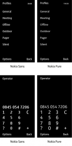
As Nokia moves forward with its new partnership with Windows, it has begun a brand strategy by creating a customized screen font that is easier to read.
The company, which has offices in Westchester County, recently announced it would cut 7,000 jobs through layoffs and outsourcing in a bid to be more competitive in the smartphone market. The layoffs followed the announcement that its smartphone operating system would be partnering with Redmond, Wash.-based Microsoft Corp. and its Windows Phone.
In February, Stephen Elop, newly named CEO in September, brought Nokia and Microsoft together in an attempt to challenge rivals Apple Inc., Google and Research in Motion in the smartphone sector.
In making its move, Nokia also commissioned London-based Dalton Maag, a design company that specializes in typography, to create a typeface called Nokia Pure to coincide with its further entry into the smartphone platform.
Nokia and its design department could not be reached directly for comment.
According to the Dalton Maag case study, the company was asked to design a font family primarily for use in digital media mobile devices and the web that would be, “versatile enough to be the cornerstone for all of Nokia”™s communications worldwide.”
Darryl Ohrt, founder and principal of Humongo, a branding company in Danbury, Conn., that focuses on online and digital design, called the move by Nokia “extremely smart.”
“This kind of involvement allows them to have complete control across whatever medium they end up working with. Where and how is this going to be viewed is one of the first questions we as designers ask ourselves.”
Ohrt said judging by the examples Nokia has given of its new font, it is not all about aesthetics.
“They”™ve really shown an attention to detail and created a font that uses its size and space efficiently,” said Ohrt.
Liz Ball, president of TFI Envision, a worldwide consumer branding and design business in Norwalk, Conn., said, “Typography is even more important in the growing smartphone space because readability has to be optimum. This is something they have to do really well because their competition is Apple and Google, two companies that have very strong design.”
Ball said there are two priorities when it comes to typography: readability and brand connectivity.
According to Dalton Maag, Nokia had to consider supporting languages using the Latin, Greek, Cyrillic, Arabic, and Hebrew alphabets, as well as the Devanagari and Thai scripts in a first-phase introduction. The company said various weights and specific display versions for different sizes were required in the undertaking.
Nokia”™s previous typeface, Nokia Sans, was developed for early stage legibility on low-resolution screens. High-resolution screens made the early fonts appear dated.
Ball said, “It”™s a win-win for the brand and makes and almost always visible element for Nokia very strong.”
Ball said in branding for technological uses there always has to be strong attention paid to how an element ”“ whether logo, typeface or brand graphics ”“ appears on the lowest screen resolution and at varying sizes.
“By creating a brand-specific typeface, Nokia is very much in control,” Ball said. “It also makes all of its on-screen text very specific to the brand and that sense will extend to the quality of the brand and the product.”
Stamford, Conn.-based Gartner ”“ IT research and adviser ”“ recently released data predicting Nokia will push Windows Phone well into the mid-tier of its portfolio by the end of 2012, and drive the platform to be the third largest in the worldwide ranking by 2013. Gartner has revised its forecast of Windows Phone”™s market share upward, solely by virtue of Microsoft”™s alliance with Nokia.
Nokia is the world”™s largest volume producer of cell phones: 432 million devices sold in 2010, but its market share fell 5 percent from 2009 to 29 percent.


