Westchester graduation rates mirror public school inequity
Public school districts”™ graduation rates correspond with the percentage of students that are eligible for free or reduced-price lunches, according to new maps from a fair housing nonprofit.
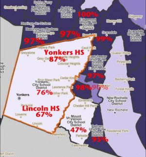
Two maps put together by Community Housing Innovations Inc. show the Yonkers and Mount Vernon school districts and their neighbors, with one map showing the percentage of students eligible for free or reduced-price lunches and the other noting high school graduation rates.

- High school graduation rates for Yonkers, Mount Vernon and surrounding districts. Source: Community Housing Innovations Inc.
The districts with larger percentages of free or reduced-price lunches have lower graduation rates. Alexander Roberts, executive director of the group, tabulated the graduation rates based on data from the National Center for Education Statistics for the 2013-14 school year.
Roberts said that suburban segregation has evolved from racial to financial. “It”™s not all racial anymore; it”™s very much economic,” he said. “And there”™s no reason why any family or any ethnic group should be denied the opportunity for a good education.”
The Yonkers and Mount Vernon school districts have 76 percent and 47 percent graduation rates, while their neighbors have starkly higher rates. Hastings-on-Hudson, Ardsley, Eastchester and Bronxville have graduation rates of 97 percent or higher, according to the data, with Edgemont and Scarsdale showing rates of 100 percent and 99 percent, respectively.
Yonkers and Mount Vernon have 72 percent and 66 percent of their respective student bodies eligible for free or reduced-price lunches, while most of their neighbors have single-digit percentages eligible.
Gov. Andrew Cuomo, a Democrat, noted the inequity of public education in his inauguration speech last week, saying public education has gone from being the great equalizer to the great discriminator. “Today, we have two education systems if we want to tell the truth ”“ one for the rich and one for the poor,” he said. “If you happen to be born in the wrong ZIP code and go to a failing public school, you can get left behind and never catch up.”
The maps were created using PolicyMap, an online data mapping tool. To determine the percentage of students eligible for free or reduced-price lunches, Roberts said the group used numbers from 2011-12 school year recipients and the 2011-12 school year counts of students as reported in the Common Core of Data from the National Center for Education Statistics.